Final Project – References and inspirations – part 3


I forgot to mention when talking about the character design, but when it comes to defyning a human figure in pixelart there are always images or old games you can find on the internet, and even if they didn’t seemed at all like the one I did, all of these designs helped me along the way.

Image


[Monster Hunter character reinterpretation by Ivancat, original source http://www.pixeljoint.com/pixelart/52321.htm%5D

Image

[The Legend of Zelda: wind waker pixel art reinterpretation by Frootsy Collins, original source http://frootsycollins.deviantart.com/art/Wind-Waker-GBA-Demake-409266914%5D

Image

Roxas_Pixel_Art_by_Alexandre_Leroy

[Screenshot and sprites taken from Kingdom Hearts, Chain of Memories, Developed by Square enix and released for GameBoy Advance in 2004]

dovahkiin

[Skyrim character reinterpretation by Szyba, original source http://www.pixeljoint.com/pixelart/74675.htm]

Hunter’s tale (aka Final Project) – designing the big boss tree (now a rock giant with trees) part 3

The day of the texturing has come! As for the other big elements, I already knew this would have taken long time, but I was surprised as it took me less then I expected. Since I drawed the giant piece by piece, I wanted to keep the pices separated to make it easier to animate afterwards. So, I started with the head.

Image

and as you can see, I removed some trees from the original design (as there would have been too much “green” and it was covering the eye and make it look less visibile), proof that the colouring part is not just about “colouring”. So I tried to make the scream face and then moved to the arm and the torso. Since a lot of elements are specular (but the light is not) you see that the colouring is pretty much the same but the gradient changes and does not mirror, as it would have looked wrong and too much specular.

Image


The final result looked like this, but there was something that didn’t convince me about the legs and how they were structured (again, as you can see, the pieces are put differently from the original sketch). So I started try different options: you can see two and them beneath this big image (the two smaller ones). The changes are very small, almost always in term of simple hierarchy, but in the end I choose to put the legs backwards and put the torso on top…

rock-giant  128  130

…and this is the final giant in all his giantness!

131


Just to try if my pieces-method was working, I tried to tear him apart. This is the result, and as you can see the legs works great. I’ve got to devide the arm into more pieces, as now they are not.

133

Hunter’s tale (aka Final Project) – designing the big boss tree (now a rock giant with trees) part 2

As I told in the previous post, from the giant tree this big boss has become a rock and trees giant, and I was now sure about the overall design of the single elements. Now that the parts were all completed, it was just about drawing all the pieces and turn them into pixel art (at least the borders, b&w drawings). So this is the new head…

Image

…and this is the torso (There are elements that are going to change, such as that tree near the neck that I think I’m going to remove).

For the torso I decided to insert a part of a tower from the abandoned castle of the environment. I thought that it would have added a nice touch to the background story of this giant: perhaps men built the castle on him while he was sleeping because they didn’t know, and as he woke up now the castle is destroyed.

Image

In thems of proportions, this was a little sketch about how the giant is going to look like: how big are his legs? how long the arms? is his head more like a normal person or more like a hunchback?

Also, in this design we decided to change the approach on how to kill the giant: firstly, we thought we should have let the character climb him, but in order to do so the monsters would have had platforms over his body, and the design looked worse; this is why we decided that eventually the trees are the points you can hit, so you have to hit the legs first, then on his knees he will punch you (hit the arms) and finally hit the head.

Image


But, how Giant was this giant going to be? I tried some proportions first, and some of them were just TOO big and would have resulted heady in term of RAM for the coding, so I made it a little smaller.

120

finally, I used the head as a referement point, and now the main character is big as half of his head. Still quite big!

rock-giant

Hunter’s tale (aka Final Project) – designing the big boss tree


There was a monster I actually hadn’t designed, and it happened to be the bigger one: started as a big, pissed off tree, it developed into a rock and trees giant, that will need to have a very well structured gameplay, as it’s too big to fit the entire screen: our idea was to have the characters hitting his legs until he fell on his knees.

First things come first, though, so these are my first attemps on designing the giant: some of them were too creepy (first image below), and some of them looked to much only like a giant tree (second image below), having therefore troubles with the design of the face: they looked way too much like ents from the lord of the rings.

ImageImage


Those designs didn’t convinced me at all. Still, there were some elements above all that I wanted to maintain in what was going to become the final design. So, instead of drawing all the giant, I only started drawing the head. This is what came out, and it really convinced me I drawed all the other parts using this graphics style (down below there is an arm).

ImageImage

Hunter’s tale (aka Final Project) – References and inspirations part 2

In the previous reference post I used as references mostly games made in pixelart to help myself getting the idea I wanted to have for the project. Actually, throughout the process, there has been a lot of more games I’ve been using as a reference, for a lot of tiny details: a monster, a weapon, a particular use of colours, game dynamics or graphic style. These are some of them.

Bastion by Supergiant Games, 2011, a milestone in the modern action/rpg field

Unepic by Francisco Téllez de Meneses and various, 2011

Devious Dungeons by Ravenous Games, 2014, the proof you can do an addictive action rpg even with veery simple elements

Shadow of the Colossus by Team Ico, 2005, because nodoby can do a game set up into a fantastic and medieval world without thinking for even one second to try to imitate some elements from this endless masterpiece

Rayman Legends by Ubisoft, 2013, because it has got wonderful monster design, animation and, specifically, a swamp level that really helped me


Hunter’s tale (aka Final Project) – armors design

The most important thing in games such as monster hunter is that you can craft your own armor using pieces of the animals you hunted and killed. Since we wanted to add this feature we started thinking of all the armors we wanted to do, and we decided that, for the demo, the best thing was not to add this feature already, but instead changing armor every mission depending on the boss you defeated in the mission before. So, if in the first mission you deafeated the big toad, you get the toad armor for the second mission and so on. This post is about the design of the toad armor.

In terms of design, of course you can’t just have your character wearing a frog skin, so I decided to use the same colour palette and add teeth (or nails) in the helmet to made it look like it’s made of “parts” of the beast. I decided to delete the beard of the character too, as it wouldn’t fit this sort of samurai-style armor. The following drawings are the concepts for:

– the standard suit design;

100

– the wyvern suit design (in black and white looks like something drangonball-ish, the colouring will remove that feeling. Also, no shield in the final version, but it was nice to try the pose as, again, there are the first human original characters I’m doing as I’m not very good with designing humans and anatomy skills)

109

– the toad armor design;

110

The following sketches are, instead, first attemps and studies of character’s pose I made with the first idea for the toad armor, that used to have a horned helmet, idea that we deleted later.

113

Without the weapons, this is how the armors designs looked like. Obviously the colour palette for the toad and wyvern armors are the same as their original monsters.

112


Final Project – more title design AND finding a title


As I told before on the other post about the title, we got a subtitle and a old book-style image that didn’t convinced me completely. There was the crest, though, that really worked, so I tried to make a small, squared version of the logo, to make it look more understandable to read.

Image


But it didn’t quite work well too. One thing, though, was essential for what would have happened next, and it is that we saw that a hunter’s tale would have work by itself as a title, I mean, it looked nice even alone, without being used as a subtitle for something else. So i decided it deserved to be treated as a full title, and changed the overall design, trying to insert items from the game behind the letters. In the end, we choose to have two crossed swords, one of them broken, and this was what it looked like.

Image

But there was the old book problem to fix. As the final aim to the Media2 assignment is to have a pdf booklet, I started putting dots together: our project was that kind of project you might have seen on Kickstarter or other crowdfunding platforms, and there are always artbooks with projects like that. I’m a huge collector of artbooks myself, as seeing other’s work is what led me to choose this field as a future job. So, why shouldn’t I build the booklet like a “beta” version of what could be the final artbook for the game? AND, how good would it be to make all the pages of the book look like they are pages of an old book, but made in pixelart? So, I changed the orientation of the page and the now horizontal page looked like this.

Image


There were of course minor issues in that version too, so I lightened up the blue palette, made the crest/sigil and remove the “A” from the title to show the broken sword too.

Image

This was nice too, but it didn’t still feel like an old book, the title need to be centered and the crest needed to be bigger. The final design came almost by itself.

Image


Final Project – first environments designs – part 6


As I started doing the pixelart for the shops, I decided again to use colours that I have already been using into other’s designs: The motivation above all was also to go a little bit “oldschool”, as older pixelart games only got limited color palette. The items looked pretty good though, even extrapolated from the context.

Image

I mirrored the fruit store and coloured it. After finally putting the props in the right place, this is what the final design looks like (note: the fruit is pretty huge in proportions to humans, but I thought it would have add a different, more fantastic feeling, and, also, made that easier for me to draw, as with pixel art, the smaller the object, the harder to draw ). The fruit seller has got medieval clothes, I felt that was appropriate. I really like the cap!

95

The final potion seller looks like this. As I told you before, the smaller objects are the harder to draw: I can say that the design of the owl took me longer then the whole tent. (second image below)

BkLbwy9CYAA2XPk


There you can see the different owls designs. I actually asked on forums and social networks to choose the best owl, in the end the B design was the winner, with more than 20 votes for him. The facebook post is private, so I’l put the twitter one as a sample.

96


Final Project – first title design and more environment designs


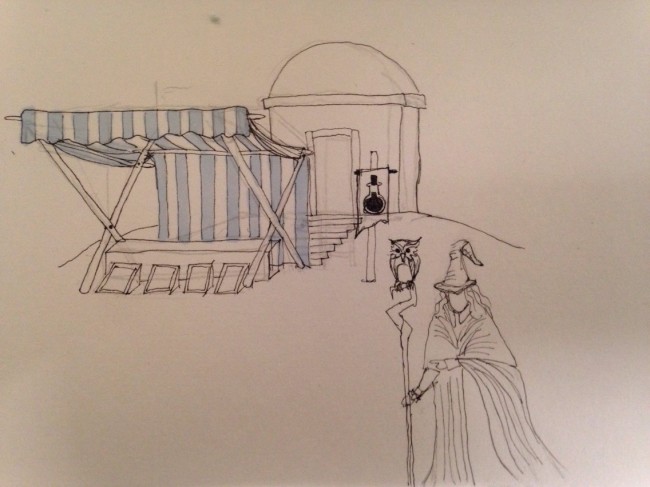
Another important shop is the potion shop: I drawed this small building with a sort of a tent that looks like those medieval fairs (or the idea of medieval fair we got). The seller would have been a mage with a big cloak carrying a staff with a pet on it: my first choice was the owl.

Image


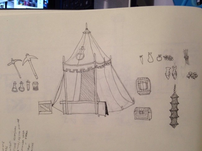
As I wanted to draw both of the shops together (ideally they were close to each other, so I wanted to design them so that they could have looked best next to each other). The idea for the fruit seller was to have another big tent, this time more like a standard tent, but as I kept on with drawing, I started realizing that such structure would have suit much better the potion shop rather than the fruit on, so I switched the purposes of the structures. It wasn’t that hard, as I drawed all the items and props separately like before.

Image


The second part of this post is about something much more important though: it’s about the choice of the tile for the game.

It may sound easy, but it’s actually really hard to think of a title for a game that wants to fit into a consolidated genre without sound already-heard or boring: we started noting up the words we might have use, and the list was very long and containing words like: beast, monster, explorer, adventurer, wandered, predator, venturer, hunter, adventure, story, tale, quest, journey, fate, destiny, land, hunt, reign, realm…

In the end, we decided to go for “A Hunter’s Tale” as a subtitle, hoping to find a very cool name for the lend to call the game with (such as the elder’s scrolls: Skyrim, to say one of the most recent and importan example in term of fantasy videogames).

We also decided for the first image/title Image to have an old book: making an old book in pixelart led me to draw something like this, complete with dragon vessel and scratched borders:

Image


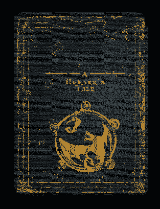
I’m not 100% convinced by this design, though, as you can’t properly read the title and the book, as later on Martin and Neal told me too, looked more like a resized photo rather then a pixelart drawing.


Final Project – first environments designs – part 5

Taking back the job from where I started, I drawed the line in pixelart for the house and do the colors (second image below). Understanding that it would have been a long colouring and texturing process, I decided to start drawing the blacksmith, as it would have been the building with more visible elements, so I started working and noting all the details and tools I wanted to put inside the house. This is the sketch…

80

…and this are the sprites drawed separately in pixelart with a first attempt of putting them all together. I put into this image the previous cart and the house to show the overall proportions of the buildings. Image

As the design of the blacksmith was over, I needed a way to create in pixelart the effect of a straw roof. This is what I end up with and, therefore, the final design for the blacksmith, with a big-bearded blacksmith hammering a sword,  in the tradition of the fantasy blacksmiths, big and strong men.

Image

As I liked the effect for the straw made with the blacksmith, I drawed the same way the roof of the house. This is the final design for the roof:

85

Of course there was all the rest of the house to be textured. I mentioned in the last post I wanted to do single floor houses too: I textured the upper roof and separated it from the rest of the house to see if individually could have worked. I liked very much and I started to change the colour of the roof. These are the final designs.

Image

Back into the big house, I started adding more textures and wooden elements.

87

The final big house looked great, so I tried another color palette to add a little change-valor into the final village, and this is it.

88

P.S. again, as I’m better with environment rather then with characters, I’m planning to draw the other villages later on.