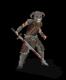
Hunter’s Tale – an analysis of why I’ve chosen pixelart and what I’ve learned so far

My idea for the project was to do a game working with pixel art. Even if it’s something “old fashioned” I decided to challenge myself with such graphic style not just to try something different, but because, due to the nostalgic way of last years, it’s been expanding a lot.

Some history first: we can say that pixelart games came back to the screen in 2004, when Studio Pixel, to make a tribute to old Metroid Games, released Cave Story. That game was important for two main reasons: it opened both the door to the indie world, showing that a small team could work on games and make those big hits, and that pixelart could have been used in modern ways. The years passed, and a lot of titles have been released for every genre, from rpgs  and platforms to shooters to point-and-click adventure games. Some famous examples are the platform SuperMeatBoy by Team Meat (2010), the first chapter of Blackwell saga, a series of point and click adventures by WadjetEye Games (2006) or even horror game such as Lone Survivor by Jasper Byrne (2012). Meanwhile, the mobile gaming was expanding too, supporting way much better 2d games rather than the 3d ones. You can find among the bigger hits on mobile gaming a lot of pixel art games, such as Jetpack Joyride by Halfbrick studios (2011), Tiny Tower by Mobage (and Tiny Death Star, a Star Wars spinoff, 2011 and 2014), and even entire companies, like Ravenous Games, that are pretty much entirely based on pixel art games ( some titles are Random Heroes, 2012, Devious Dungeon, 2014, Beatdown, 2013). Even bigger companies, like Square Enix, has been developing pixel art games and republishing their old ones, following the nostalgic wave, and Disney made a full length movie, Wreck-It Ralph (2012) based on characters of arcade games.

The comeback of pixel art has given developers the freedon to experiment too, experiments that led into huge commercial successes: games like Superbrothers Sword and sorcery tried to mix both pixelart and digital painting, having a strange gameplay that turn the whole game into an experience out of genres rather than “just a game”. Marcus “Notch” Persson take the pixilated graphic style and, using a graphic based on cube boxes, put that into a 3d world: the result was Minecraft, that from its release on 2011 has sold millions of copies and has developed loads of merchandise: you can’t get into an hmv today without seeing keyrings or books about it, and even lego has developed some sets based on it.

Meanwhile, another wave was expanding, the crowdfunding one: websites like Kickstarter or IndieGoGo has helped and are still helping minor developers to develop games. Again, most of them are remakes or tributes to elder ones, as they are the one more people are willing to pay for. For example, Hyper Light Drifter by Heart machine asked 27,000 dollars. After 28 days, they got 645,158.


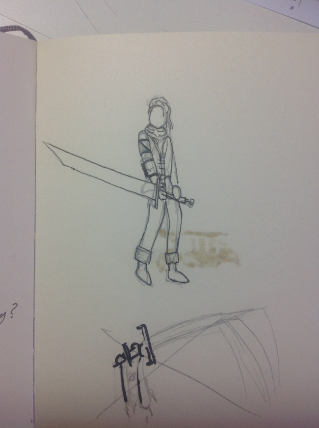
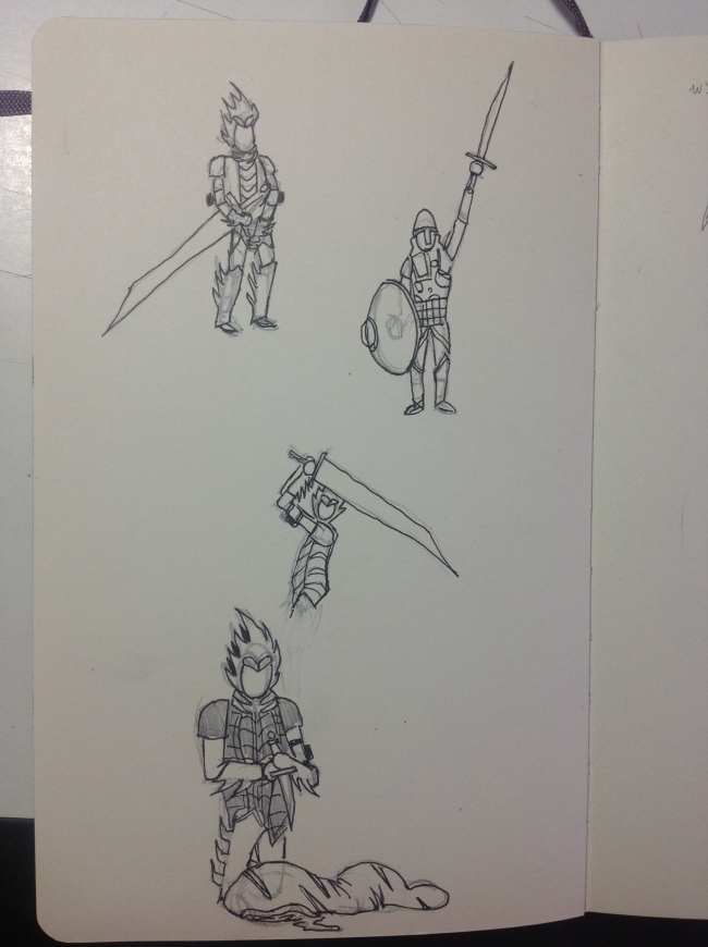
So, as I knew pixelart was worth trying, I challenged myself with that. As it was actually a new field for me, I tried to make the way I would have made it with standard digital painting, only by drawing it on paper first. That helped me defyning the borders, to which I had applied colours and textures. It may sound easy put in those words, but it’s hard, especially with smaller objects or with characters: how can you define a face that doesn’t look stylized or too much cartoonish when you have a bunch of pixels?

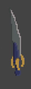
Working with that concept in mind helped me learning what details are “expendable” when you work on such things: in the character design, for example, I choose not to include eyes on the face, but just eyebrows, and the overall design doesn’t seem to be overall strange or make the character look unfinished for the fact he doesn’t have eyes. Or, for the monster design, how can you define a mouth or treathing teeth or nails then you can do that only with 5 or 6 pixels? Or, again, designing the sword, how can it look sharpened when it’s only 3 pixels wide?

I learnt to managed all those elements and issues by making them, and another hard step was trying also to use other people’s art as reference without seeming to copy it. For characters design, for example, if you want to work on human proportions (so not making stylized character, let’s say in the Zelda or Pokemon style) there are not a lot of variables to include, so you have to worry about not making the character look like someone else’s one: as I haven’t got a lot of skills in terms of anatomy or human design generally, I tried to manage that using the overall style of single elements, like a hand, or a leg. I’ll see if they will work properly when I’ll animate it.

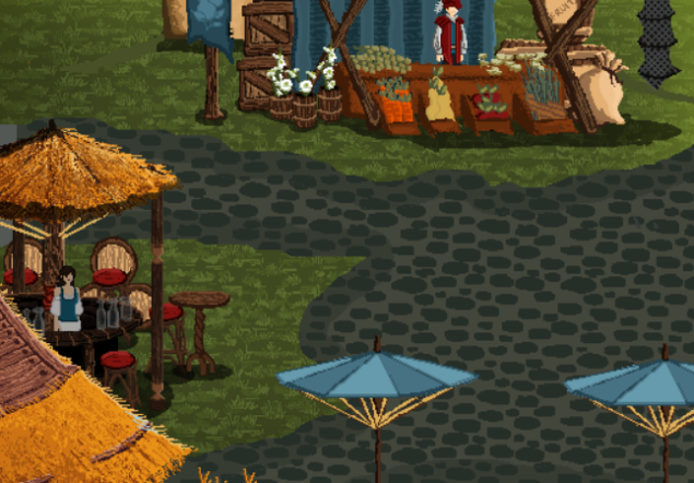
In terms of environment design, everything was challenging but easier, as they are bigger and therefore easier to “compress” in pixelart: it was fun to experiment with textures such as with the straw roofs, with the bricks for the castle or with the trees trying to make a pixel look like a leaf.

But I didn’t just improve my pixelart skills during the past months: I’ve chosen to do such a project because I loved the idea of creating a fantasy ecosystem filled with monsters, as I already worked on environments but I never tried to populate them in a both zoological and fantasy way. The following months will be a bigger challenge, as I will face the animation part, and some of it will be very hard, as there are a wide range of objects, creatures and characters I will need to make move.
Hunter’s Tale – Pdf download link and a (late) introduction to the game idea

It may sound strange, but the last thing I did about the miniartbook (it’s how I like to call it) was to write the introduction. Even if it’s in one of the final post, I though it would have been appropriate, even if late, to post even here what has been the motivation and the idea at the beginning of the Hunter’s Tale project.

The nostalgic wave of last year’s the game industry has taken a lot of artist into projects (tributes to old game or genre) that have become more personal and able to stand by themselves. Above all the revivals and 3d remakes there’s been, though, a category less considered, and we wanted to go back there. At that point, going with pixel art was an obvious choice.

Our idea was to make a tribute to the old action rpg’s such as zelda and monster hunter, trying to melt together the idea of “open field” and “dungeon crawler”, having therefore a space lived by different sorts of beasts. The player is a wanderer hero that want to help a small village he found during his journey, surviving the wilderness just like he used to do but then selling the leftovers of his hunts to the village and using them to craft stronger armors and weapons.

We’re planning to finish a small demo by September, with a number of missions bound to one area only (the swamp) and, instead of allowing a personalized armor crafting, to have a specific armor and   weapons in each mission to show directly how this vary the gameplay, that need to be more tactical and not just consisting of going forward randomly attacking.

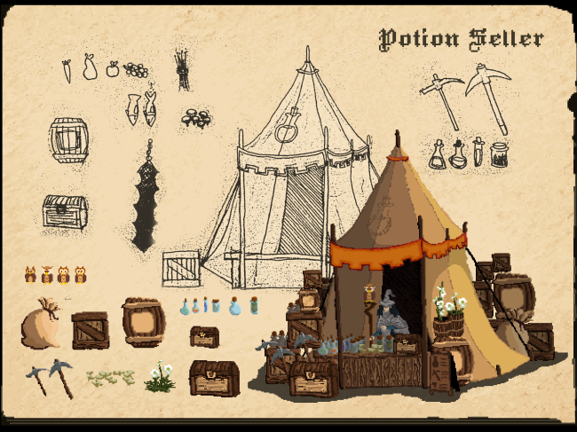
In terms of graphics, the challenge is to create a “medieval” world with a proper flora and fauna that needs to feel both realistic (in the excerption of an inner coherence that would make it plausible) and filled with fantastic creatures and elements: this is why you’ll find secondary elements like a fruit seller and a farm in the village design (actually useless to the player) or monsters such as giant “mosquito-like insects” in the swamp. Also, I hope you’ll see how the choice of using a pixel art graphic style has not influenced the amount of details in the overall design or made it more stylized.

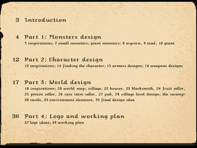
These forty pages focus on the graphic research of the overall style and the design of environments, characters and creatures are going to be put into September’s demo and the finished game later on. To strenghten this concept I decided to make them look like an old book, but made in pixels.

And, finally, as I’ve finished the pdf layout work, here it is! Hope you’ll like it. That’s a wrap!

Click to access Francesco_Segala_HuntersTale.pdf

(update, old link is not working, try this https://www.dropbox.com/s/5cza8bcje6rhmzv/Francesco_Segala_HuntersTale.pdf )

Hunter’s Tale – Pdf layout and final designs part 2

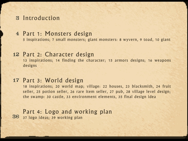
So, finally, these are more designs for the pdf’s pages, and except for the page number, are the final ones. As you can see, the font for the index has changed (this fit so much better).

The font I actually used all over the pdf are two: HeinzHeinrich by pheist (http://www.dafont.com/heinzheinrich.font) and Venice Classic by soixantendeux (http://www.dafont.com/venice-classic.font)

Image

ImageImage

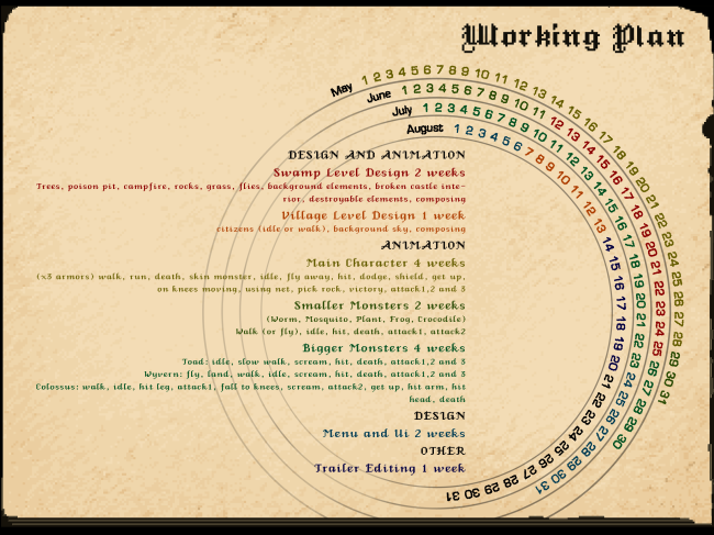
The working plan was a hard one to do: I didn’t want to add a long chart as I already saw on previous years’ works. It’s not that I don’t liked them, but I thought that the chart would have looked out of place in this sort of artbook. So I looked around the internet for medieval calendars or some of them that looked like medieval, and I came up with this design of circular calendars. I coloured the days as the activities I’m willing to do in the next months. I designed it to look coherent into the book, I hope that it will look clear too.

Image

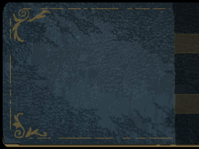
The back cover was not just the mirrored version of the front one without the title. I tried to modify the texture elements to make it look different even if the page has got the same overall design.

Image

Hunter’s Tale – Pdf layout and final designs


As the designs for the creatures and environments are over, I finally got some time for the layout design of the final pdf. I told before I wanted to give him an overall old book style, so the first thing was to draw the standard page, that I after that mirrored to give the even/odd tone to the overall design.

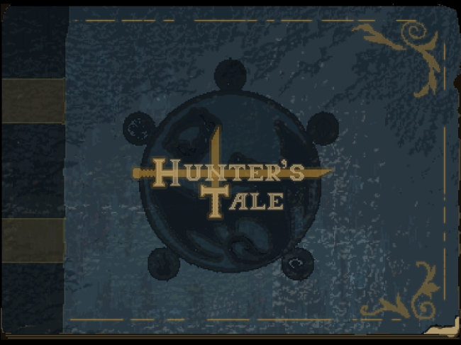
Another important thing, for the first time I decided to use InDesign for the pdf layout (it may sound obvious to use, but I hadn’t in the past). You already know the cover.

Image

The following are some samples of pages taken above the 40 final ones (including froncover and back cover). Those are not 100% completed, as in the index I think I’m going to change the font and in the other pages there’s not the numeration. Still, I’m satisfied I managed to put into the same pages both sketches and pixel art and giving to all the material that look like a videogame artbook I wanted to give them.

ImageB


Image

ImageImage

Hunter’s Tale – environments part 8 or tile texturing part 1


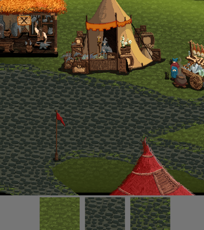
The village needed an early texturing process. I’m not saying that the final version will have borders this straight, but that’s a first step nonetheless. The important thing when designing big textures is to work with tiles. When I designed this grass I made it so that a sequence of squares would have not just fit together, but feel like the texture is not a repetition of fitted squares like the sign of a jigsaw. There are some palette correcting in the end to make it fit more the other’s designs.

In the second and third image you can see the same kind of work with the stone tile. For this stage, the border between grass and stone is consisting into a tile that’s a middle ground between the two of them, so stones and grass on a grey-ish green.

ImageImageImage

Hunter’s Tale – environments part 8

As time never gives me rest, I ended the tavern design today, and I tried to insert the elements into a rough version of the village based on the sketched I put on the last post. There are no textures on the floor yet, but I like the overall feeling, especially for the main structure with the female bartender.

ImageImage

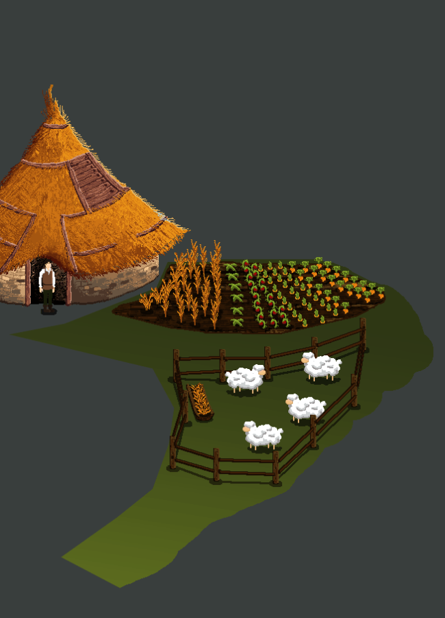
As I mentioned it before, I decided to get rid of the farm. Actually, when I drawed the village there was this little corner on the extreme right that would have fit a small garden perfectly, so I crop it and designed the small garden, trying to put inside also some farm animals. There wasn’t so much space, so I choose sheeps. The plants seeded are not supposed to look like anything we have in this world, except for that sort of  wheat.

Image

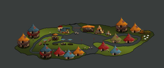
So, after finishing the farm, I put it into the overall village design. Again, there are no textures or trees or water all around, and I will need to change the shadows for the houses (they can’t possibly all have the same shadow design), but this is final starting to get to the end. Also, probably the final island is going to have bigger boundaries, as right now it looks a little bit too small then I think of the proportions into the overall map design.

Image

Hunter’s Tale – environments part 7

I said way back in the blog that I would have kept the citizens designs to the end; as I though for one moment to remove the garden/farm from the design, there was left only the tavern and the citizens. Later on I decided to reintroduce the garden, but meanwhile the citizens were not completed. For the first time I tried to draw them directly into pixelart, using only medieval clothing images as references.

Image

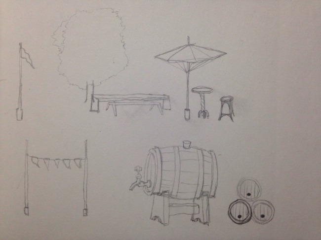
The tavern needed to be an open building, so I decided to give it a look like the Hobbitton’s one from The Lord of the Rings, so separated elements like beer cans or tables.

Image

This is the pixelart work so far. It’s still in progress.

Image

Meanwhile I started drawing the overall design for the village, trying to put all the pieces together. At an urban level, the village is quite simple and it’s based on a central square with two circular roads at left and right to take people to their homes and one big road up to down that it’s going to be connected to the bridges to go outside the village.

Image

Hunter’s tale – more character posing (sketches)

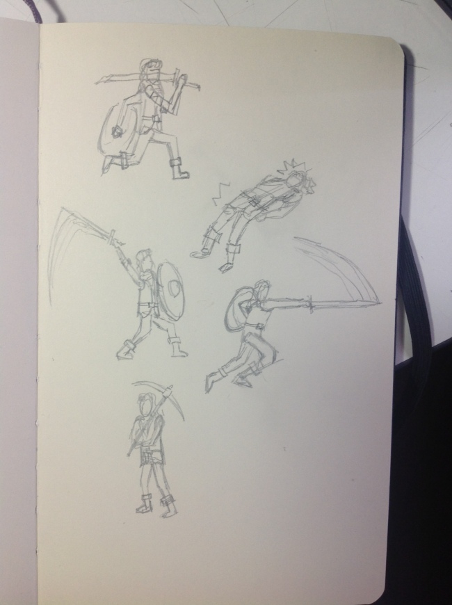
In the first post about this project I listed what could have been all the ideal animation for the characters. As my goal with the preproduction is to focus only on the design and not on the animations, I decided not to draw any animation sprites as there won’t be both enough time and the right place in the pdf to show them. Still, I wanted to improve my character posing skills, so I drawed the following little doodles, trying to search what could have been the best poses for actions such as: attacking, runnind, staying still (idle animation), skinning monsters, ausing different weapons and attacks, fall away, winning…

ImageImageImage

Hunter’s tale – weapons design


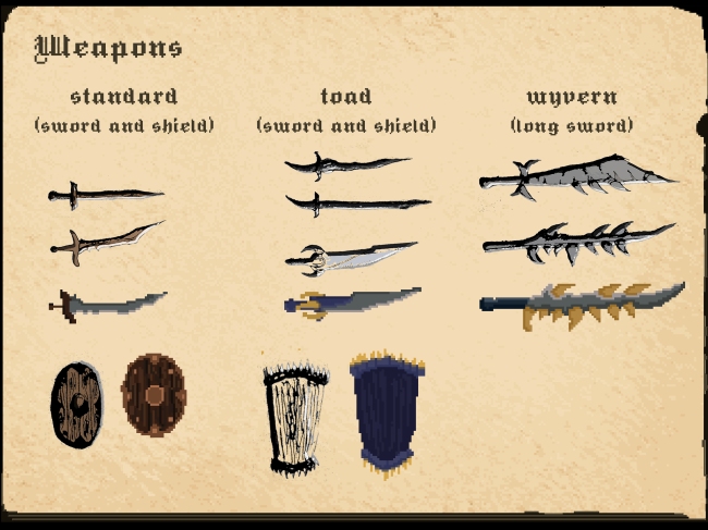
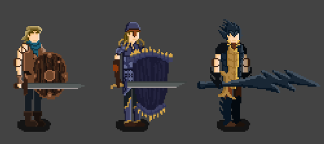
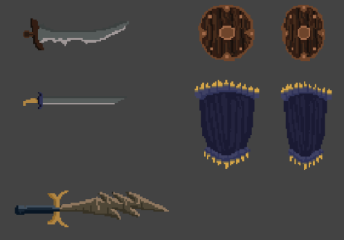
The design of the weapons was very intriguing: from one side, the standard, basic one was supposed to look very “normal”, from the other side the toad and wyvern should have looked like made of parts of the killed beasts. Also, we decided, as in the demo you will use the wyvern armor and sword against the giant, it would have been pointless to have a shield. We choose then to give to him a bigger sword, the kind of sword you need two hands to hold, so that it could have vary the gameplay. The first designs ended up being though too much standardized, and looked like this.

Image

Now, both of the shield worked, but the basic and toad sword were too much similar and common-looking, and the colours for the big wyvern one were just wrong, even if the idea was to use the wyvern’s tail as a weapon was good, we needed to change that.

So, the standard one was now more interesting, but the toad sword was still too average, so I needed to change that. The wyvern design too needed to change completely.

Image

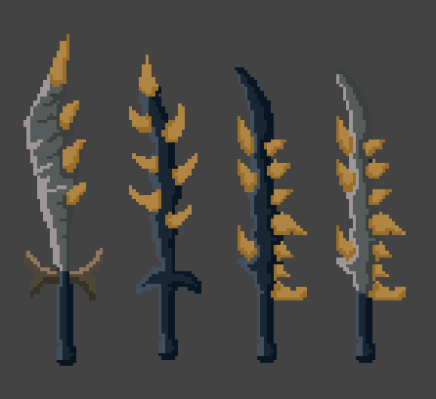
The tail effect in the wyvern sword needed to be removed: these are tries to change the sword’s overall idea from tail recycle to a sword with teeth and nails inceptions. Also, I made the standard sword and the toad one smaller, but the toad’s design still didn’t convinced me.

Image

This is the final evolution of the wyvern big sword: I tried to go back to the previous colour palette to see if it could have worked with nails, but it didn’t. Still, the design was smoother and more narrow, so I used the tones of grey again and the fourth design was the one that finally convinced me.

Image

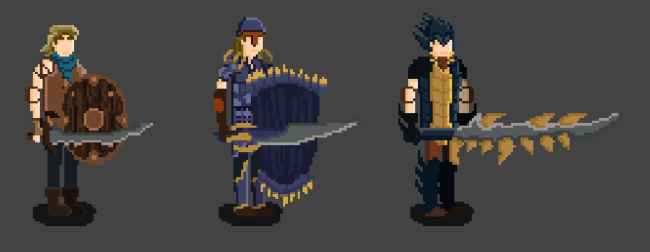
These are the final designs with the characters. The finished toad sword has a look more aggressive and thick then the other two, and that gives its own identity.

ImageImage

Final Project – References and inspirations – part 3


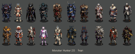
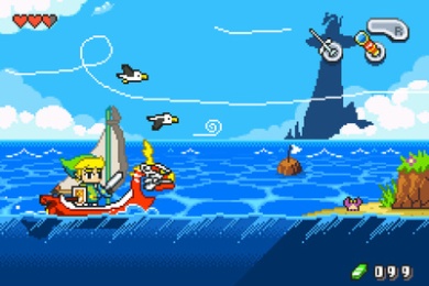
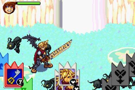
I forgot to mention when talking about the character design, but when it comes to defyning a human figure in pixelart there are always images or old games you can find on the internet, and even if they didn’t seemed at all like the one I did, all of these designs helped me along the way.

Image


[Monster Hunter character reinterpretation by Ivancat, original source http://www.pixeljoint.com/pixelart/52321.htm%5D

Image

[The Legend of Zelda: wind waker pixel art reinterpretation by Frootsy Collins, original source http://frootsycollins.deviantart.com/art/Wind-Waker-GBA-Demake-409266914%5D

Image

Roxas_Pixel_Art_by_Alexandre_Leroy

[Screenshot and sprites taken from Kingdom Hearts, Chain of Memories, Developed by Square enix and released for GameBoy Advance in 2004]

dovahkiin

[Skyrim character reinterpretation by Szyba, original source http://www.pixeljoint.com/pixelart/74675.htm]